Make the material-theme a little more mobile friendly: #127
Conversation
In the smallest of the bootstrap breakpoints:

1. use a single column layout, rather than a two column layout
2. make the navigation menu items inline-block so they form a
   horizontal menu across the top of the page
3. remove padding from the content div
4. don't scroll posts separately from the "background" of the page,
   leave it all as one linear stream
|
👍 from me, please try cleaning it up. But perhaps (2) would work better if you used the bootstrap-style expanding menu, if that’s possible? |
|
Cool. Have any pointers to documentation/tutorial/example of the bootstrap-style expanding menu you're referring to? Also is there a nikola style guide or should I just try to match what's there? |
|
I mean the menu |
2. implement responsive menu
|
Updated the review. Excuse my ignorance, I'm still not 100% positive what you meant by the menu, but I think I implemented it. As implemented, it looks like this: unexpanded: expanded: |

|
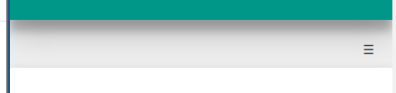
I meant a menu that behaves the same way https://getnikola.com/ does on mobile. The hamburger button would work better as part of the green header. |
Also restore the attribution button layout since the changes I
previously made seem to make it unclickable.
|
Ok done. Moved hamburger button into the header. Now looks like this: Closed: Open: |


|
Looks great, thanks for fixing this! |
In the smallest of the bootstrap breakpoints:
horizontal menu across the top of the page
leave it all as one linear stream
The comments probably aren't desirable and I didn't even check on style issues... but if the change is desirable I'd be happy to clean up this patch.