Visual and structural improvements to docs generator HTML #4755
Conversation
|
I've added a The live preview shows the current state. There is also an enhanced search interface based on this PR and #4746. I'd like to get this or the other merged so I can rebase accordingly and keep a simple commit history. |
|
Good job! Can't wait for this
I am against using web fonts. Keep it lightweight. |
|
There is way too much spacing added in the sidebar, both regarding the width and line spacing. I'd say the spacing is too much even as it is right now. |
|
Thanks for your remarks @oprypin, I'll address your comments in one:
|
|
Here's what I see. |

|
Tahoma on the left (which is the current default if Avenir is not available) has much bigger letters than Roboto on the right, even at the same font-size. The paddings are exactly the same, it's just that the letters on the right are smaller and therefore increase the impression of space around the text. |
|
Do you not see that the picture on the right has a wider sidebar and also fits in less text vertically? They are taken at the exact same scale and viewport size |
|
|
@oprypin Oh yes, the width of the sidebar changed slightly but this has nothing to do with paddings. Before, it was a relative value ( Mobile sucks before and after. I have a few improvements for that (including toggleable sidebar) but I'd address this in another PR because this one is already quite extensive and tweaking a responsive layout can be challenging by itself. I'd prefer to get this merged as the standard layout for "normal size" screens and then work on improving other sizes. @RX14 I don't see any benefit in using line-height over vertical padding. There shouldn't be any line breaks inside a type list item, so there shouldn't be any difference. But if there would be one by any chance, it's better to have the space between items defined as padding instead of line-height. |
|
@straight-shoota the benefit of |
|
@RX14 I guess that depends on your defaults. The triangle element |
|
I'm usually very tolerant to design updates if they aim to minimalism and efficiency. But in this case I strongly dislike new fonts. They are much harder to read. Regarding to headers, it feels like serif font. I vote for Roboto! 👊 |
|
What about separate pull requests? I want all of this except fonts. Fonts may be subject of another PR. |
|
Sure, I can easily extract the fonts to discuss them separately. Though I'd like to hear what others (especially core members) think first. |
|
First of all, the structural changes are very welcome. It follows overall good practices and cleans things up 👍 I'm not fond of visual changes. The bolder view-source link is attracting the attention too much and isn't very pretty. The new fonts may follow the Crystal branding, but this isn't a crystal branding website, this is a reference. We should focus on readability, try to fit better with the gitbook documentation maybe, not impose Crystal branding to the documentation of each and every project. To be honest, I don't like the actual fonts either. I wish we used a mere Also, the actual sidebar behaves better on smaller screen than yours. I'm not talking of smartphones screens, but half of my 15" laptop screen for example: yours takes too much space, at the expense of the documentation. |
|
Thanks for the feedback!
|
|
No. Half of my 15" inch laptop screen is bigger than my 9.7" iPad. It's a lot bigger than my 5" smartphone ! |
 straight-shoota
force-pushed
the
jm-docs-improvements
branch
from
straight-shoota
force-pushed
the
jm-docs-improvements
branch
from
54d24d4 to
0641a4f
Compare
|
@ysbaddaden I wasn't talking about physical dimensions but visually perceived size. A typical 15" laptop screen fits about 80 to 85em horizontal, a smartphone or tablet usually somewhere between 50 and 60em. So half a 15" screen actually fits less characters per line than a 5" smartphone in default font size. I have removed the font changes from this PR and opened #5053 |
straight-shoota
force-pushed
the
jm-docs-improvements
branch
from
0641a4f to
e830275
Compare
straight-shoota
force-pushed
the
jm-docs-improvements
branch
from
e830275 to
0641a4f
Compare
* adds a:hover indicator
* increased border for h2
* limited width for content elements (p, pre) to 55 em for improved
legibility
* adds a slight background and border for inline code elements
This dries up sidebar code.
Element IDs for CSS selectors are replaced with classes to reduce specifity in
stylesheets (avoid specifity wars).
Flexbox is better than absolute positioning as it allows for more
flexible layout and dimensions.
straight-shoota
force-pushed
the
jm-docs-improvements
branch
2 times, most recently
from
601df5b to
666efe0
Compare
straight-shoota
force-pushed
the
jm-docs-improvements
branch
from
666efe0 to
01f7e08
Compare
|
@straight-shoota Is this PR dead in the water? The search input's placeholder text is not accessible as-is, according to the W3C's WCAG specification:
Using this CSS resolves the issue: .sidebar input::placeholder {
color: black;
font-size: 14px;
text-indent: 2px;
} |

Pretty much, yes. Most of the proposed changes have been applied in separate PRs. Not even sure what else is left to do. So I guess it's time to close this. We can alwas cherry pick items from here. Please open a new PR for the placeholder text. |
|
Okay, I've opened #11604. |
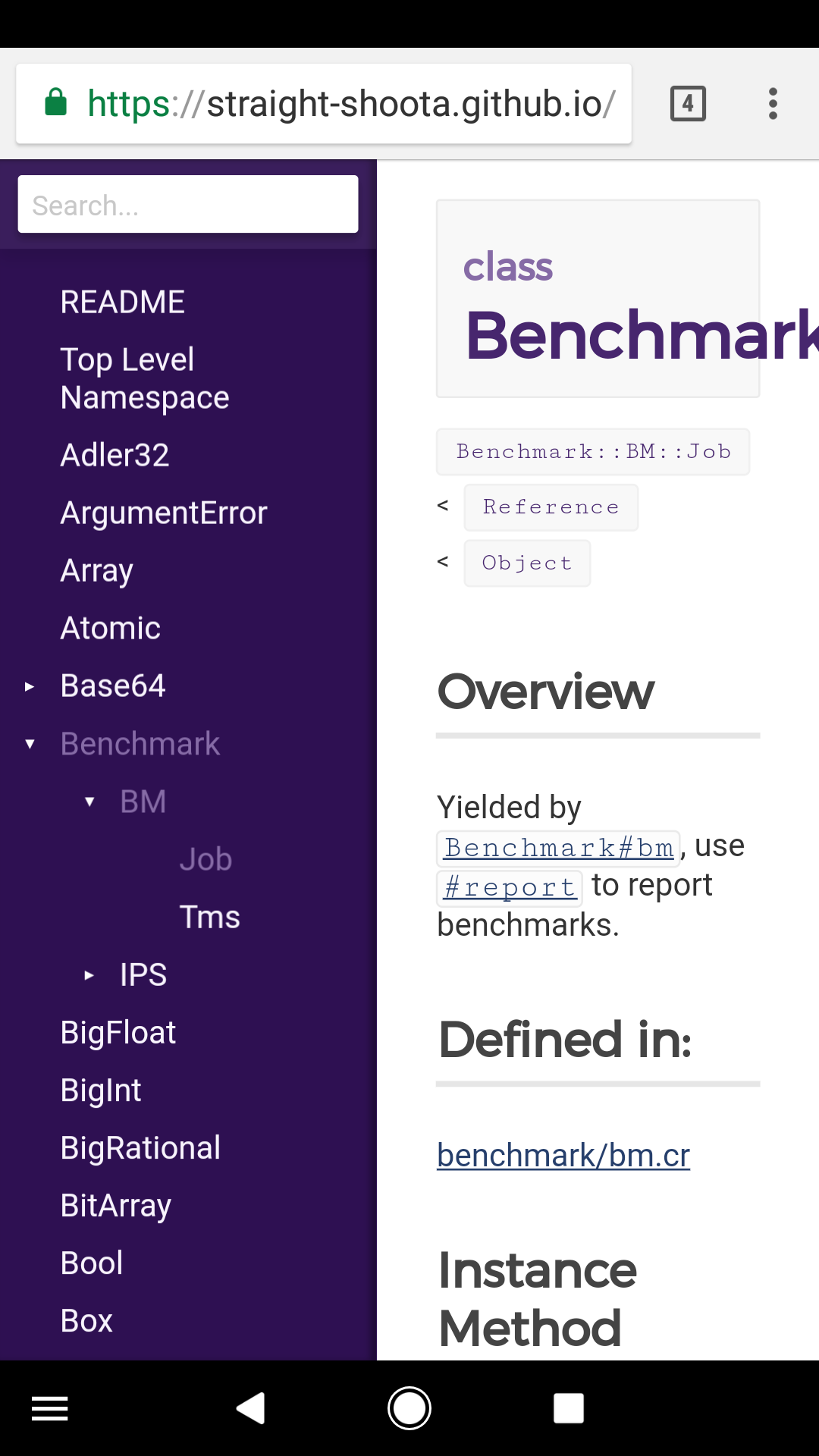
This adds the following improvements to the docs generator:
Structural
<head>into partial_head.htmlpartial (DRY up)_sidebar.html(DRY up).sidebar-headerelement (which currently includes.search-box)Visual
.source-linkwith improved visual style to source linkschanged default font to Robotoadded Montserrat as accent fontp,pre) to55 emfor improved legibility.sidebar-headerand.types-listFonts
Font changes have been removed from this PR to be discussed in #5053
The API docs should use Crystal's CD font Roboto as specified on https://crystal-lang.org/media/ to have a similar visual style as other Crystal resources. The previous default Avenir is not openly available and fallbacks Tahoma, Lucida Sans and Lucida Grande don't look very nice.Better alternative fonts are Muli and Lato whith a similar appearance to Avenir, so I added them as fallbacks, too.
Montserrat looks nice with Roboto for headlines and other accented styles.All added fonts are available on Google Fonts, though only the defaultsRoboto and Montesrrat are loaded through the stylesheet.
Preview
LIVE PREVIEW
README with fonts and h2 border-bottom:

Sample with fonts, code background and limited line length:

Sample with source link and limited line length:
