Add job status headers (web useability for red/green colorblindness). #624
Conversation
|
Please include a before / after screenshot :) |
|
Original form screenshot: New version with this patch: |


|
Thanks. This looks so good. @samueldr want to take a look? |
| <th colspan="2">Success</th> | ||
| <th style="width: 2em"> | ||
| Jobs | ||
| </th> |
There was a problem hiding this comment.
I do not have a hydra instance setup with to test the layout, but from reading the code it looks like this would add an additional column with the name "Jobs", and three other columns, while the following changes only splits the existing column in three. This leaves four headers for three columns, possibly putting the successes under jobs, the failures under successes and queued under failed? Tell me if I'm wrong here.
There was a problem hiding this comment.
Your analysis is not quite correct.
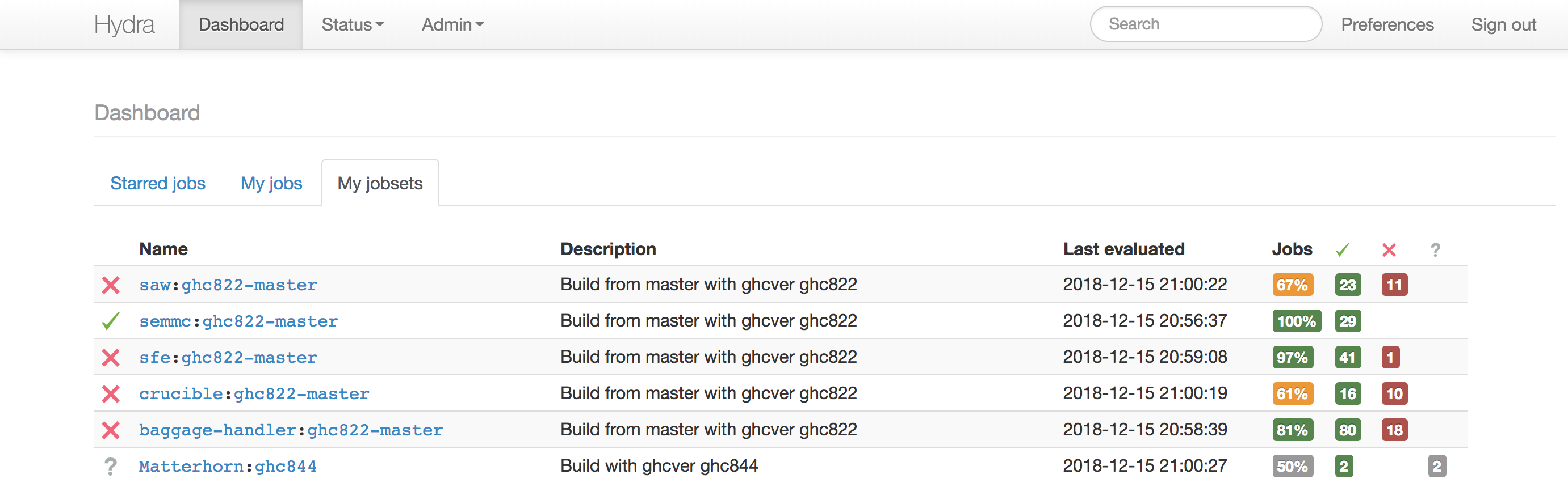
For this page, there were originally two columns: one contained the success percentage value and the other column contained the 2-3 indicators of success count, failure count, and (optional) queued count. The "Success" title spanned both columns.
The change converts it to 4 columns: the percentage column now has the header "Jobs" and the 3 other columns have the associated markers as headers, with the corresponding counts separated into those three columns.
I'll post a screenshot shortly.
There was a problem hiding this comment.
Here's the screenshot for this page:
I don't have an account on the nixos hydra to show the corresponding older page, and would need to back out my changes locally, but I'm guessing you can see the existing configuration easily enough from your account.
There was a problem hiding this comment.
Eek, sorry! Yes, this looks fine!
There was a problem hiding this comment.
The idea is solid, the implementation requires a couple changes.
First, let's go with the nit picks.
HTML attributes in the template should be consistently quoted using double quotes unless the value includes them. (Yeah, I know the template mixes them :/ already).
But then, let's not get aggravated on nit picks!
Delta icon
It would be better not to rely on the font of the end-user when the other glyphs are images. I would have said "use an emoji one triangle pointed up", but they don't have a non-red variant. (Red here might confuse non-colorblind users reading the page quickly.) Here using the emojione 2.2 triangle pointing up as a base, I made an alteration respecting the colours of the other glyphs.
- emojione-black-triangle-2471.svg.txt (Rename it as
.svg:/ github is being dumb here.)
This is a bit weird to go through all this trouble only to switch to a different looking triangle! This will additionally allow the icon to be given a pair of alt/title attributes to explain what the column means! (Just as the other columns do.)
Stacking headers
The way you have stacked the Jobs label on top of the checkmark seems to work, but this gives the first column a bit more width compared to the next two. The last one is given less width because of its missing width: 2em style. (Though this comment is only valid when the columns all have digits with the same width.) While this is slight, it's also easy to fix (imho).
The fix would be to add another <tr> on top of the table, with an initial empty <th> with a variable colspan ([% IF !jobset && !build %]), up until the last four columns, then followed by a <th> of colspan 3 for the statuses, and an empty <th> for the remaining delta column. This also makes the header a bit more semantically correct.
It may be that to be entirely semantically correct, we'd prefer to use rowspan on every columns except those with jobs, if you're unsure how to test it that way, I can look into providing a diff with it.
src/root/common.tt
Outdated
| </th> | ||
| <th style="width: 2em"> | ||
| <img src="[% c.uri_for("/static/images/emojione-question-2754.svg") %]" height="12" width="12" title="Queued" alt="Queued" class="build-status" /> | ||
|
|
There was a problem hiding this comment.
Be mindful not to add empty lines where there were none.
(Same for the other instance in the file.)
…eader, column sizes.
These two lines were literally cut-and-paste, and while I am surprised (and saddened) to be criticized for following the existing conventions of lines immediately before and after my changes, I have changed the quoting style as requested.
The SVG you supplied was a black filled triangle, not an uppercase Greek Delta character (the convention for indicating change) so I have modified it to supply the latter in the update commit.
I had not visibly observed the difference, but you are correct, there was a 5.47 pixel difference between the column widths, so I increased the column sizes and they are now reporting identically.
I have not given the final column a width because there is nothing to the right of it that would be affected by its width in the layout process, and there are several other columns (for this and other tables) which do not supply a width, leading me to believe that the width was a subjective addition for layout aesthetic purposes. If there is another intention here I am unaware of, please feel free to add the width styling.
My initial implementation used this approach, but the standard table styling added a separator line between the two header columns, and the result looked less appealing, because "Jobs" was then floating by itself in a row with a visual separator from the following row which contained the other headers, including those that it referenced. While style overrides could be specified, the existing solution seemed simpler.
It's not clear to me what this would achieve, so perhaps I am not understanding your suggestion. If you are requesting something like: then it seems like the existing: provides the identical visual representation but it is easier for both the layout engine and the user maintenance of this code. Alternatively the word "Jobs" could simply be removed, but since I find myself repeatedly explaining to users what these columns indicate, it seemed that the addition of this simple term would improve the understandability of this table for newer users. |
Yeah, sorry :/ I'm quite new to this project here and didn't really know whether to nit or not on that.
Yeah you're right here. I was more concerned into finding an existing glyph in the existing collection than actually concerned with the meaning behind it. Looks good.
Right, I tried being brief in my review, and the intent behind the sentence was lost. I meant: "and if anyone wonders about the last column, it's not important whether it's the same width or not, and it's not right now because of how it doesn't have a width". Nothing has to be changed. Stacked headersHere's the end-result when stacking the headers using rowspan.
Yes, there was an annoying border added by bootstrap's styles. Here's the diff I used to achieve this result. diff --git a/src/root/common.tt b/src/root/common.tt
index 963c806d..6ebeb217 100644
--- a/src/root/common.tt
+++ b/src/root/common.tt
@@ -408,25 +408,27 @@ BLOCK renderEvals %]
<table class="table table-condensed table-striped clickable-rows">
<thead>
<tr>
- <th>#</th>
+ <th rowspan="2">#</th>
[% IF !jobset && !build %]
- <th>Jobset</th>
+ <th rowspan="2">Jobset</th>
[% END %]
- <th style="width: 10em">Date</th>
- <th>Input changes</th>
- <th style="width: 2.5em">
- Jobs<br>
+ <th rowspan="2" style="width: 10em">Date</th>
+ <th rowspan="2">Input changes</th>
+ <th colspan="3">Jobs</th>
+ <th rowspan="2">
+ <img src="[% c.uri_for("/static/images/delta.svg") %]" height="12" width="12" title="Delta" alt="Delta" class="build-status" />
+ </th>
+ </tr>
+ <tr>
+ <th style="width: 2em">
<img src="[% c.uri_for("/static/images/emojione-check-2714.svg") %]" height="12" width="12" title="Succeeded" alt="Succeeded" class="build-status" />
</th>
- <th style="width: 2.5em">
+ <th style="width: 2em">
<img src="[% c.uri_for("/static/images/emojione-red-x-274c.svg") %]" height="12" width="12" title="Failed" alt="Failed" class="build-status" />
</th>
- <th style="width: 2.5em">
+ <th style="width: 2em">
<img src="[% c.uri_for("/static/images/emojione-question-2754.svg") %]" height="12" width="12" title="Queued" alt="Queued" class="build-status" />
</th>
- <th>
- <img src="[% c.uri_for("/static/images/delta.svg") %]" height="12" width="12" title="Delta" alt="Delta" class="build-status" />
- </th>
</tr>
</thead>
<tbody>
diff --git a/src/root/static/css/hydra.css b/src/root/static/css/hydra.css
index 9fe6e651..7eebc588 100644
--- a/src/root/static/css/hydra.css
+++ b/src/root/static/css/hydra.css
@@ -157,3 +157,8 @@ td.product-icon img {
width: 16px;
height: 16px;
}
+
+/* Assumes borders are never desired in multi-row thead. */
+.table thead th {
+ border-top: 0;
+}The first part of my suggestion, in hindsight, wasn't good at all.
This is what I meant with rowspans; the first row builds the usual Only as an example, I put back |

|
I understand about being new and wanting to improve the consistency of the code . I agree with your ultimate intent, although I think that is probably better accomplished as a pass of its own instead of addressing those concerns on individual PR's. Thanks for the clarification on the rowspan-based solution. I've updated the PR with this approach. I do appreciate the review and suggestions, thank you! |
|
Thank you! |
The original form of reporting on job status for a jobset is to simply report numbers inside of a red or green box. Other than the color, there is no indication of what the number indicates. For red/green colorblind people, these are indistinguishable (in fact, my red/green colorblind co-worker indicated that the gray in-progress/queued color was also indistinguishable from the other two).
This change adds column headers with the conventional icons to clarify the meanings of the numbers using indicators that are visually distinct apart from color.