Change: New layout for the Station view window #7540
Conversation
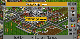
The old layout was getting very cramped in the buttons row. The new layout moves "query" buttons to a separate row between cargo waiting and accepts/ratings panes.
|
Although the spacing is better, it does feel a bit odd that they're in the middle of the window now. |
|
Another option might be to keep the original one-row layout but move some of the buttons under a dropdown, e.g. Location and Rename as a dropdown under the Accepts/Ratings toggle. |
|
This a bit of a wildcard suggestion, but would it be an idea to have (some) buttons in a vertical row on the right, like the depots and vehicles have? It's more or less the route that Chris Sawyer took with RCT and RCT2. There is also the option of introducing tabs here - again, something CS did himself. Though CS only used tabs that took up the entire window. (I hope you don't mind a filthy OpenRCT2 team member coming over to your turf :P) |
|
Well someone would have to draw art for those vertical buttons :) |
|
Sure, but you have a graphic for "Location" (the one on the vehicle window). "Rename" can use the sign icon, which only leaves "Close airport". Should be feasible if you end up opting for this route. :) |
|
Okay more radical ideas inspired by @Gymnasiast which I haven't attempted yet:
|
Sounds interesting. After playing Locomotion I never understood, why the station window of (Open)-TTD has no viewport window. In Open-TTD vehicles, towns and industries have one, only the stations have no viewport window. So the viewport window would not only be "looking nice" but would also be a harmonisation. The vertical row of buttons, borrowed from RCT and Locomotion, should, if implemented, IMHO be a general UI element not only for the station window. |
|
The vertical row of buttons has always been in the vehicle window, since TTO. The main argument against using it in more places is, I think, that you need art for the buttons, so you can't add a new button without either art already existing, or someone to draw it. |
|
Poor sketch of my above idea: |

|
Oh, that looks like a very nice layout! As for the sort and group buttons/dropdowns: why not put those above the cargo lines? It's where they are on lists of vehicles, for example. |
|
Attempted adding a viewport, using placeholders for some of the button icons: |

|
|
|
The viewport doesn't necessarily need to be as tall as the space that the vertical button take up. In RCT, there is often some blank space left over under (or above) the vertical buttons:
|

|
I don't think the viewport code in OTTD supports (easily) hiding a viewport like RCT does when switching tab, so the viewport couldn't be resizable because the details list below it would be the resizable part. |
|
Right, but I'm not talking about resizing - what I mean is that you could leave some room blank below the vertical row of four buttons so that the viewport can be bigger.
The window code in RCT is quite complicated, and so is OpenRCT2's, since we haven't yet done much about it. Our code was actually partially taken from OpenTTD 0.1. |
|
With this PR, I think some players will want to be able to revert to the old style, so could you add the following two settings for that?
Additionally, how are you gonna handle CargoDist destinations while in the tabular form? |
|
|
|
To start spawning settings for UI elements here and there is IMHO not a good idea. If one setting exists, someone will want to have another one for another UI and someone will want to have another one ... it's a bit like a sisyphean job. |
|
More possible ways to go:
|
|
I don't think I'm getting any further with this myself. Unless someone wants to vouch for the original idea here (shown in the initial post) this should just be closed. |
The old layout was getting very cramped in the buttons row, especially after #7446. The new layout moves "query" buttons to a separate row between cargo waiting and accepts/ratings panes.