Adjust violet smallmap colour 1 shade darker after #7436 #7450
+1
−1
Conversation
This file contains bidirectional Unicode text that may be interpreted or compiled differently than what appears below. To review, open the file in an editor that reveals hidden Unicode characters.
Learn more about bidirectional Unicode characters
…or legibility against darker blue of sea introduced by OpenTTD#7436
glx22
approved these changes
Mar 30, 2019
Sign up for free
to join this conversation on GitHub.
Already have an account?
Sign in to comment
Add this suggestion to a batch that can be applied as a single commit.
This suggestion is invalid because no changes were made to the code.
Suggestions cannot be applied while the pull request is closed.
Suggestions cannot be applied while viewing a subset of changes.
Only one suggestion per line can be applied in a batch.
Add this suggestion to a batch that can be applied as a single commit.
Applying suggestions on deleted lines is not supported.
You must change the existing code in this line in order to create a valid suggestion.
Outdated suggestions cannot be applied.
This suggestion has been applied or marked resolved.
Suggestions cannot be applied from pending reviews.
Suggestions cannot be applied on multi-line comments.
Suggestions cannot be applied while the pull request is queued to merge.
Suggestion cannot be applied right now. Please check back later.
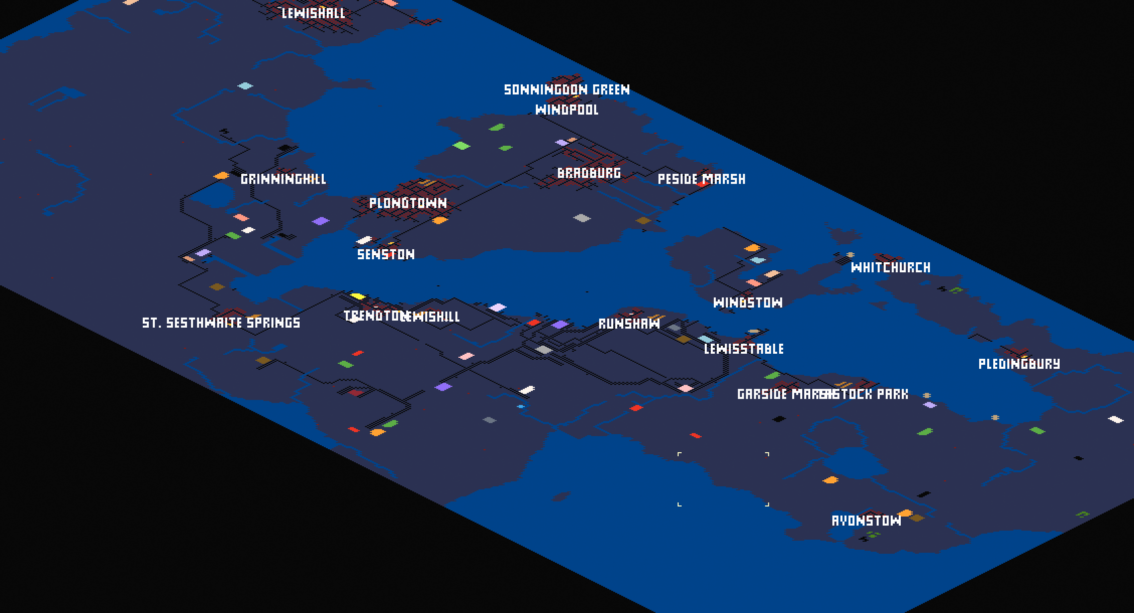
#7436 changed the smallmap sea blue, so that it no longer conflates with dark blue company colour. That is a clear improvement generally.
However the smallmap colour options include violet. For me, following this change, whilst the blue and the violet are distinguishable as separate colours in the smallmap, the coastline is now very undifferentiated and hard to see the shape of.
This is highly subjective, and no-one else who tried could replicate the issue. My display has a currently uncommon P3 wide-gamut colour space, which is likely a factor. Notably other wide-gamut displays may be implementing the alternative Adobe RGB colour space, which has a wider range of blues than P3. Simulating Adobe RGB on my display does reduces the problem, which adds weight to the idea that this is caused by colour spaces.
So after that fascinating tour into colour spaces, I made the violet 1 shade darker than previously.
Which fixes the problem.
I can't find any negative side effects.
I tested for legibility problems with company colours, they're all fine to my eye.
A number of other people in irc compared the before and after, and nobody reported any problems at the time of writing.
Violet smallmap after 7436

Violet smallmap as adjusted by this PR
Things I also considered and rejected here:
I'm using 'smallmap' because that's what it's called in settings GUI. I usually call it mini-map, but eh :)