You signed in with another tab or window. Reload to refresh your session.You signed out in another tab or window. Reload to refresh your session.You switched accounts on another tab or window. Reload to refresh your session.Dismiss alert
Markings are legible and unambiguous. A glance at the graph is enough to see the period to which the value relates.
Actual result
Marking is very faint. In addition, the manner of markings makes them ambiguous.
Solutions
It is not necessary, 1 point alone will improve a lot, but the best effect in my opinion will be a combination of all points.
Changing the size of the default small font - taking into account the current average resolution of monitors, it would be advisable to change it to a slightly larger one. Here, however, there is a problem with the size of the station labels, which for most fonts become larger than for the default medium font.
Changing the way of marking periods - instead of abbreviations of month names, you can use Roman letters for marking quarters. It is a frequently used solution, definitely more readable and, above all, much more logical.
Extension of auxiliary lines - so that they separate the symbols of periods; the lines separating the years would be slightly longer than those separating the quarters
Highlighting the lines separating the years with a different shade - in the case of a dark background it would be a color one shade lighter than the other auxiliary lines.
The text was updated successfully, but these errors were encountered:
Version of OpenTTD
20210114-master (applies to change #8557)
Expected result
Markings are legible and unambiguous. A glance at the graph is enough to see the period to which the value relates.
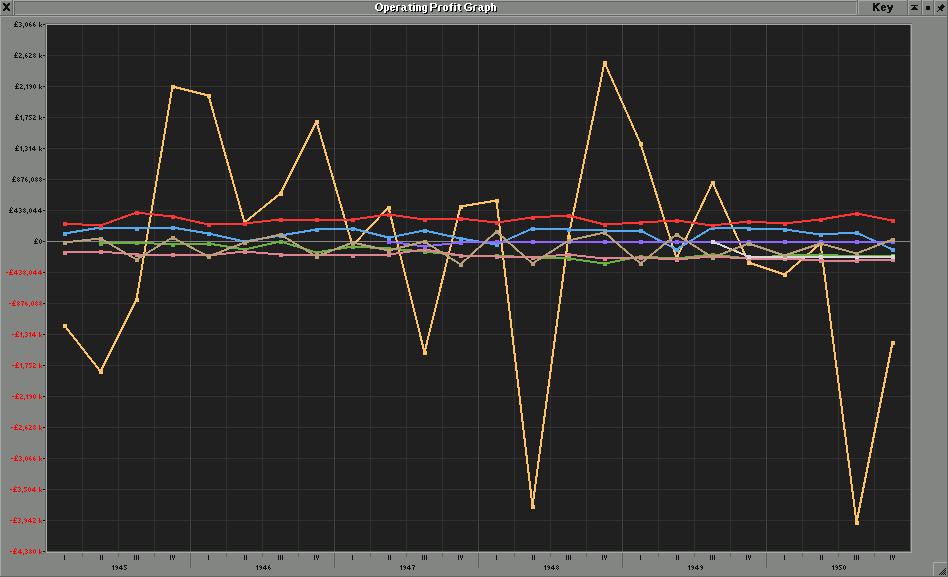
Actual result
Marking is very faint. In addition, the manner of markings makes them ambiguous.

Solutions
It is not necessary, 1 point alone will improve a lot, but the best effect in my opinion will be a combination of all points.
The text was updated successfully, but these errors were encountered: