You signed in with another tab or window. Reload to refresh your session.You signed out in another tab or window. Reload to refresh your session.You switched accounts on another tab or window. Reload to refresh your session.Dismiss alert
The window looks good and fits stylistically with the rest of GUI
Actual result
The colors of the guide lines are too bright and irritate the eyesight.
The dark background creates a kind of internal screen that, unlike the other windows (vehicle window, extra viewport), has no frame.
Adding a frame for the dark area of the ghaph - it can be a single shadow that gives a shallow niche or a double shadow (recess) separating the graph area from the rest. The latter solution would also work for light backgrounds and the option to change the background.
Note
It is not particularly important, it's only detail, but in my opinion it gives an interesting effect, consistent with the rest of the interface.
The text was updated successfully, but these errors were encountered:
Version of OpenTTD
20210114-master (applies to change #8557)
Expected result
The window looks good and fits stylistically with the rest of GUI
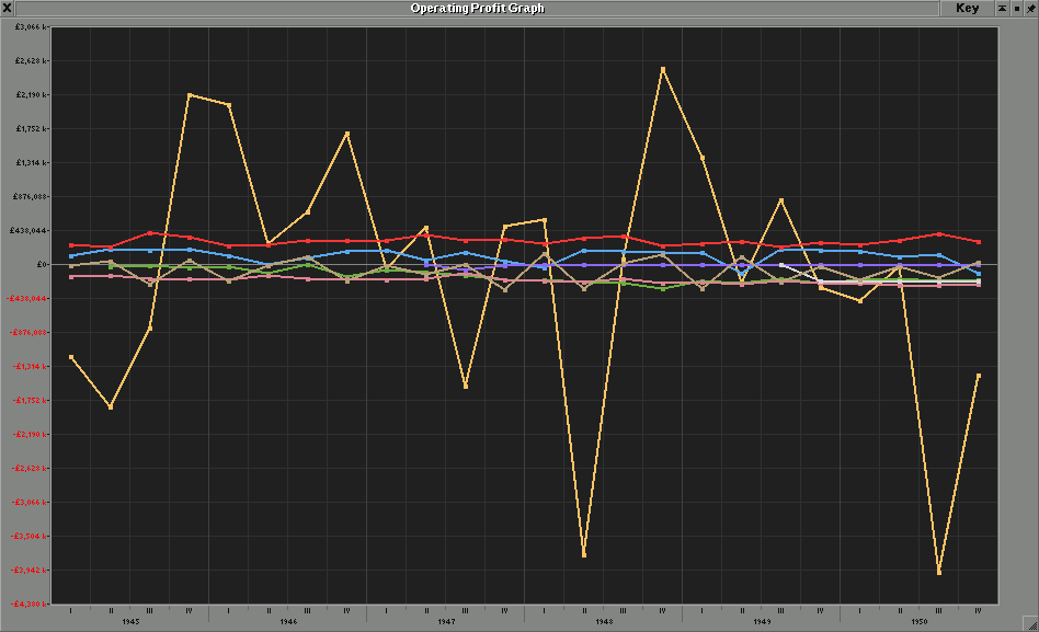
Actual result
The colors of the guide lines are too bright and irritate the eyesight.

The dark background creates a kind of internal screen that, unlike the other windows (vehicle window, extra viewport), has no frame.
Solutions
Note
It is not particularly important, it's only detail, but in my opinion it gives an interesting effect, consistent with the rest of the interface.
The text was updated successfully, but these errors were encountered: