redesign: Implements last MVPs #533
Conversation
One of the variable was accidentally a global.
I don't know how else to characterise that in the DOM that would be more
semantic :/
Note that a well is a specialized "semantic~ish" notice-box.
Otherwise with left-leaning navigation, the repeated text is quite
problematic.
|
I think there is not enough differentiation between the menu element and the box. It has the same color and shape. In the mockup, the box is grey, so less prominent. The visitor is visually guided to the menu.
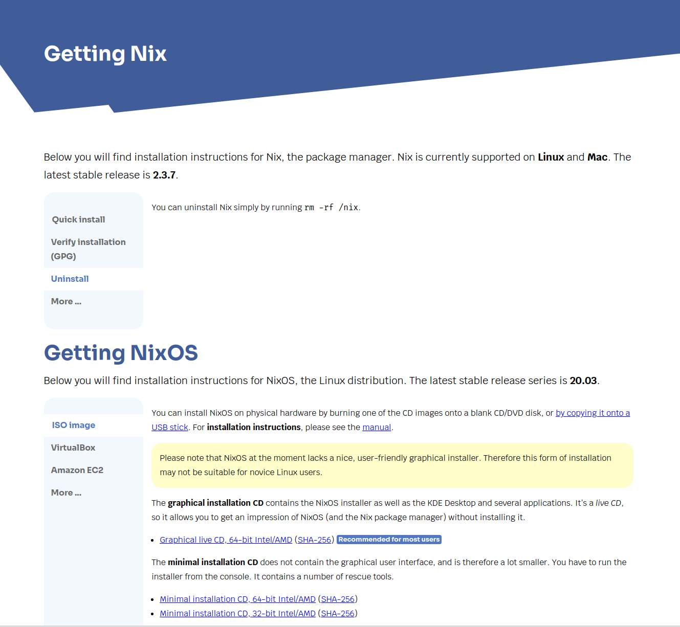
I like the layout of having the manu on the left and content on the right. Feels more natural than the actual tabs before. I noticed, that on this page are 2 sections, Nix and NixOS, but the site title is Get Nix and a H2 is NixOS. The site tetle should probably be "Download Nix or NixOS" and there should be 2 H2 "Getting Nix" and "Getting NixOS".
The selected menu entry has a white background, like the site background. That destroys the shape. That's probably a bad thing to do. Maybe using the blue is already better. But it seems also not perfect to me.
Also the black (terminal) feels too heavy on the page. All other colors are very light on the page. This is my terminal on a white background:
It is a transparent dark grey.
Maybe we have a dark grey in the new color palette? |


Hopefully it's wide enough for most "infinite" widths...
Buttons will be the same height *per-row*. A min-height could be used to
force a minimal height if desired.
|
One thing that can be improved (later) is that many terminals are shown as text boxes.
https://5f62bd18944835c008ff9ff0--nixos-homepage.netlify.app/guides/install-nix.html |

|
I'm going to merge this and we can fix the rest in separate PRs |
This implements the following pages
While for the download page it looks like a lot of work has been done for the looks, don't be deceived!
This is only the exact same DOM as the tabs from the donate page. Oh wait, look at the donate page, it's also much better than the previous structural-only implementation of the tabs, @davidak!
So yeah, this was the plan all along, add basic "yes this is a tab" styles in the previous PR, but actually implement what the mockups had for tabs.
Mockup for reference
Like how a good carpet can tie the whole room together, a simple and judicious application of styles sure can transform the downloads page!