Feature: rework in-game Network GUI #9067
Conversation
|
It may not be beautiful, but it is functional and above all small. :) What will happen then with the small clients list window? It is still needed, just small. Many players use it permanently, thanks to which they can see who is currently in the game. Among other things, if you wanted to write to someone, you did not have to open the window and check the presence every time. If you change this window in this way, you will remove one of the most useful features in online gaming from OTTD. If it were to be an additional window, or something like a large resizable finance window, the player markings would be inconsistent. Then something like this would be better... Here, too, the method of changing the nickname is inconsistent. The one from the servers window is much better. Mainly because it is more noticeable. In the event of a server name change, it will only be available to the administrator and is something that usually does not change during the game, so there is no problem. It is better to place a possible resizing icon on the left side - the window always enlarges to the right so it will remain in the same place when pressed. Yet another point is that it would be nice if the client list window would always appear when you entered the server and be pinned (in left top corner?) by default. Why? So that new players do not tire over and over with questions about who is online. ;) |

|
This is now ready for review. I did add custom code to right-align the text, as not to be blocked by #9063 . But once that hits, this one should also profit from that. Additionally, I would like to move "new company" into this window, but I do not know how yet. Future-work, for another PR :) |
There was a problem hiding this comment.
Issues I have seen multiple times I generally only mentioned once for now.
I do see some validity in the old style window as a means to see who is currently on the server in relatively little space, though this window seems to be a lot more user friendly for the common case. I wonder if there is some, already existing, functionality that allows you to toggle between a small and large variant of a window, as if that were to exist this might be a nice place to use it.
The only "added space" is some vertical about changing your player name. And hopefully soon about which server you are connected too. I think at this point there is no need to make a toggle for that. Lets first see what 90% of the people think about this, I would reason. Not a big fan of solving issues we don't even know is an issue :D (things are easily judge from a screenshot, but it is just that, a screenshot). The horizontal space is nearly identical (in minimal size); as non-admin there is even some more room horizontally per client. So we are good there. |
|
Also renamed "advertised" to "visibility" in the "Start Server" GUI, to make it sync up a bit more with this window. Also, future extensions will need that anyway :) |
You scare me sometimes. :) Do you seriously want to do human experiments? Such a window will really be a "big" problem. Screenshot from reddit server. There are usually around 20 players there. Sometimes over 30. Exactly 30 here.
Of course it is and is used in the finance window. :) |

|
I've messed with a bit and noticed some peculiarities. Player #1 joined, but the list is not updated. Should it be possible to join Player #1? There are no buttons for this user? I joined with two clients, then quit one, kicked the other and joined again. Upon rename the list is not updated, possibly the root cause same as the first one. If the local player has no name I have no clue where I am. Clear network.client_name in the configuration. The save game with 15 companies to make reproducing possibly easier. |


|
Seems most bugs you mention are because when you join as a spectator, the list is not updating. And after that, the companies/clients are not in sync with the buttons, and just strange things start to happen. I wonder if I can guard that any way .. not sure yet. But first, need to find where the update is not happening :D |
|
Okay, fixed the following:
Would you mind retesting pretty please? :D |
@LC-Zorg: I am really not sure what you try to accomplish here, but this constant acting in bad faith on your part is getting old. You seem to be out to giving people stabs where ever you can. This is not the first time I am telling you this. I strongly suggest you adjust your tone, and try to be constructive in conversation. For example, try to ask a questions in stead of judging partial information you collected yourself .. that goes a long way. But most of all, stop with the backstabbing: it is childish. |
e5ff6d6 to
b19e43d
Compare
This comment has been minimized.
This comment has been minimized.
|
@LC-Zorg : yeah, I am going to say this for the last time. If you insist on replying in bad faith, you are no longer welcome here. And to be clear, I am not talking about what you say, but how you say it. You constantly give stabs, insult people, and in general just reply in bad faith. That is not wanted and acceptable here. So last time: change your tone. |
|
Icon for chat button: Height is 10px to fit the default sprite font. Width I picked arbitrarily. |

|
With a little bit of help of my friends, finally figured out how to add sprites :D I think that looks a lot better than text. At least a whole less "in your face". |

The question I got asked, why a player should care what number the company has. And I didn't have a good answer :D I do not really mind one way or the other, but maybe you have an answer to this question: does it matter to know what numeric value your company has? (honest questions, to be very clear :D) |
c1a26ec to
6d4a43a
Compare
3c747a3 to
0b1f3f6
Compare
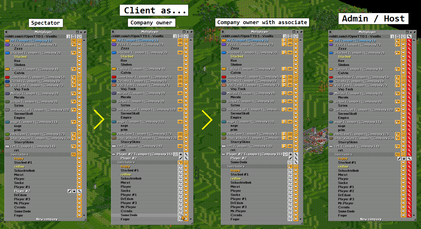
The GUI now more clearly shows some basic information about the
server you joined, your client name (and the ability to change it),
and what players are in which company.

It also contains useful buttons to press to join companies, chat
with other people, and for admins to kick/ban people.

Additionally, renamed "advertised" to "visibility"; this has to
do with future additions, but also because it is more clear in
wording.
You can now easily do:
- a password reset (unlock)
- remove an empty company (reset company)
Especially if there are many players online, trying to chat with
the right one can be a visual challenge. This can be solved by
highlighting the row you are on. This visual cue is often enough
for humans to find the right row.
|
Hello, I just want to add a few suggestions for further discussion, if I may. There are a few things, which could this improve further.
|
Of course you may! :D
Already taken care of! "Player" should be a thing of the past :D
One could argue to completely remove it, but yeah, it should be part of this window. Good call!
I like the idea. Well, honestly, the list of ideas this GUI opened up is pretty long already.. but for sure I am going to put this one on there too :D Tnx! |
|
Hope it's not too late. :) I didn't have much time to write back. I also had some ideas, but for this I had to do few graphics... Merging companies? Transferring money? How do I use the client list? Player marking Minimalist version Anyway, I made new graphics, where a large Multilpayer window and a small Client list window I think would make a harmonious whole. :) Hope you like it. Description:
Ad.1. Regarding server rules and information, I did something like this for Map of Poland server via script. Not everyone wants to add a script, much less not everyone can write the right one, so I think something like that would be really useful. Small window Mandatory setting of the nickname and password of the company before entering the game Additional Features Private conversation Blocking the message Registered nicknames |


No worries.
Future work for sure :)
What always annoyed me most, that you gave a "player" money .. like .. no, you give the company money. That made no sense. But back in 2004 that was the only way possible .. we now know better :)
Tnx for the details! We will track this for a bit too see if others show similar interest! :)
Icons I can give tooltips; colours I cannot :D This is mostly why I don't like colouring.
I mostly like how you did server-name. We will have to see after we added some more fields there to see how it looks, and what we can do to make it better. This for sure isn't its final form yet, but I first need to see the full scope before I can really understand what good looks are :D So let's wrap back on this before release :)
Cool idea; and as I said before, there are many cool ideas to extend from this :) I will put it in the "future work" list. If someone is bored, for sure he can spend a few weeks on these future works alone :D
This gets very close to a friendslist, which is still something I hope we can add .. ugh, more future work :D
Exactly this :) Duly noted :)
We went for a simpler approach: we no longer enter a player name by default, and if it is empty, you get an error telling you to fill in your name :)
What most games do, that your chat always go to your latest selection. This is, I guess, what more people are used to by now. So when you start a private chat with someone, your next chat will also be private to him. Sometimes goes hilariously wrong, but yeah, that is what you get.
Good idea, will add it to the list.
I drafted a "Centralized Authority" concept years ago, where players can (optionally) register their name and use this to identify with servers. Can be useful for all kinds of reasons, also to track score over multiple games etc. But .. this is far from done .. |
Fixes #9035.
Motivation / Problem
Please follow me down a rabbit hole:
For an upcoming feature we need to show server owners an "invite code" which they can hand to others to join their (private) server. This requires a place to show this "invite code".
The most sane place for this is the "Multiplayer GUI", which currently is just a client-list.
This was the only problem I wanted to resolve .. sadly .. I had a case of feature-creep.
While thinking about how to solve this, some additional things came to mind:
Basically, we made a lot of things possible via the console, but not via the GUI. So, after some internal debating, I finally made the call to do something about it.
I really did my best to scope this PR as small as possible. That is to say, I tried to add as few new features as possible, but mainly make the new GUI work better and make it more extendable towards the future. Later PRs can add new functionalities. We have a wishlist ;)
Description
When I wrote the original Multiplayer GUI (client-list), I distinctly remember me saying: this GUI is so ugly and unfinished, sure someone will fix that up soon, as I really hate building GUIs.
Well, now 17 years later, I have the answer for you: no, nobody did. So yeah .. I spend 3 days of my life fighting the GUI system. Not because it is bad or what-ever, but because what I want it cannot deliver. So there was a constant fight going on. I think I somewhat won .. but I leave you to be the judge of that.
I opted for a dynamic Button system, similar to the client-list dropdown, as otherwise I had to duplicate the complex logic which entry has which button. This way, it is calculated once, used multiple times. But please, review carefully if I go about memory usage correctly .. I am really not sure I understood
std::mapandstd::vectorsufficiently :DCurrently which server you are joining is not stored or sync'd, so we cannot show client-side what the server-name is etc. This is for future PRs to extend on this, but left out of this PR to keep it GUI-only. This means that on clients the "server" part is hidden for now.
There has been some feature creep on this PR, as people wanted more and more and more. Some things really should have been additional PRs, but GitHub doesn't really allow that workflow .. so here it is, in 6 commits. Please see the 6 commits are their own PRs, and you should be fine :) I can split any off if you so like!
Limitations
None that I know of; it should contain the exact same functionality as the old one + a bit more.
Future work
These things are all currently out of scope of this PR, but of course, I can be convinced otherwise.
Codewise:
Feature-wise:
Checklist for review
Some things are not automated, and forgotten often. This list is a reminder for the reviewers.