Graph Window - Colors of the mauve, dark green and purple companies are barely visible #8539
Comments
|
Assuming you are also https://www.tt-forums.net/viewtopic.php?f=32&t=88329, let me say: big fan of the work :) Let's see what we can do for the graph .. I have no clue :D I am about to find out ;) |
|
So, how things work in OpenTTD: These graph-colours are based on the company-colour. Every company has 8 "gradients" you can pick from. This is currently set to "6", which is a very light variant of the company colour. In the PR I just created I changed that to "4", which is a bit darker variant. The downside? It means ALL lines are now darker, not just the few that stood out. But there is not much choice in the matter honestly.
I tried "5" too, but this made other colours much harder to read:
I would love opinions about my choice here! You can see the work I did here: https://preview.openttd.org/pr8542/ |

|
For future-reference, https://grf.farm/misc/company_colour_reference/html/company_colour_indexes.html shows the gradient per company. |
|
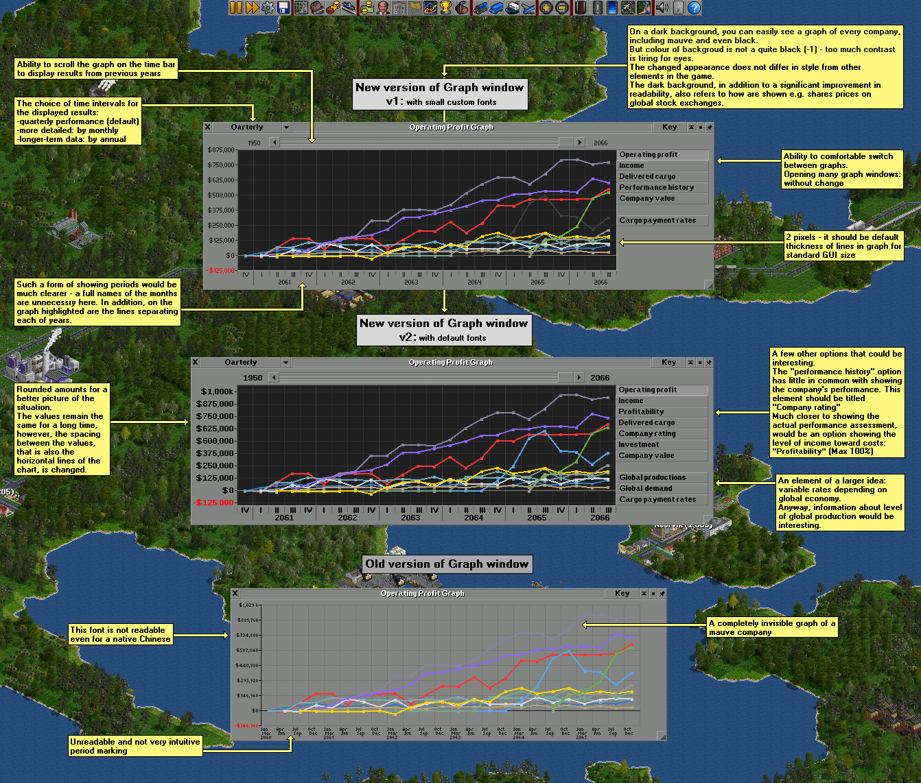
Thanks for the feedback. I have a bit more of these scribbles, but there is not enough time to describe and refine them in places. Well, unfortunately these are just only more ideas, but I hope they will be useful somehow. For example by showing how not to do something. :) This was what I expected and was afraid that the level of these colors may be combined. Level 5 is definitely out of the question due to the gray color which would be completely invisible - I checked it before. Level 6 seems a little too dark and didn't refer well with the companies colors elsewhere in the game (I think so). I am not a programmer (I read OTTD code as easily as Asian characters for an average European) and usually when it seems to me that something is easy, it turns out to be surprisingly difficult. Here, I could write that the best solution would be the possibility of assigning a selected color to each company individually (preferably including the full RGB palette). And that seems like the only right solution, but I also think it may not be that simple. So I have another solution, but not necessarily easier. ;) The graphic below is almost two years old. It might be a light offtop, but I think it could be useful... |

|
Oeh, pretty GUI. I think the solution I propose, is not a good one. Sure, it does fix some of the problems, but I am sure others will become as visible as easily. I like your dark background solution, and it seems to be a more correct solution. In general, as you noticed, many of our GUIs could use a facelift to become a bit .. modern? more readable? less weird? :D None of us are UI or UX designers, which might be apparent :) Not sure what a good next step is; I have to think about it for a bit :) |
Cleaned up grf.farm a bit, file now at https://grf.farm/misc/company_colour_indexes.html |
|
Looks pretty good honestly. I think your other changes are also well worth integrating, but this might just be a nice temporary solution for 1.11, while we make all the UIs a bit better in 1.12 :) |

|
This is now available in preview in https://preview.openttd.org/pr8557/ ; what you do think @LC-Zorg , good enough solution for now? |
Version of OpenTTD
Probably all, including the current 1.10.3
Expected result
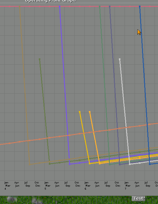
Visible and easily distinguishable charts of each company.
Actual result
Company chart lines with the colors mauve, dark green and purple are faint or very faint in the charts windows. The problem is especially with the color of the mauve.
Comment
It is enough to change the colors of the lines of the mauve, dark green and purple charts to 1 shade darker (looks more, but the difference is only 1 shade). Helpful, but not so important, will also be to darken the orange color also by one shade.
The text was updated successfully, but these errors were encountered: