Pressing a station name in the station list doesn't move you to the correct station #9337
Comments
|
I tried to reproduce this issue, but I couldn't. Everything I tested works as expected. |
|
I had someone reporting this issue for citymania client (supposedly) as well: https://citymania.org/forum/topic/125 |
|
Ah, nvm, I can repro it now, posssibly something to do with font size. |
|
Actually, in master this was already fixed by #9073 (or may be it even predates the bug) so it's just a question of backporting now. Anyhow, 1.11.2 can be fixed by changing in station_gui.cpp to |
|
Closed, already fixed. Thanks @ldpl ! (I've added the backport label, but a new 1.11 release is unlikely) |
Sign up for free
to join this conversation on GitHub.
Already have an account?
Sign in to comment
Version of OpenTTD
1.11.2 (new bug)
Expected result
Pressing a station name in the station list takes you to the correct station
Actual result
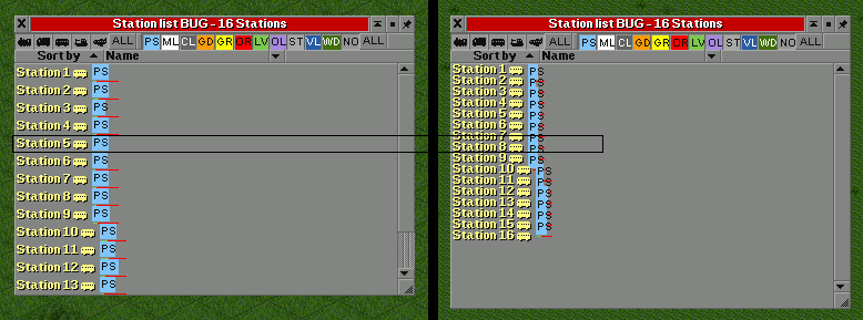
Pressing a station name in the station list will move you to another station lower in the list. The bug appeared after increasing the spacing between lines of text (1.11.2). It looks as though the spacing between the lines of the text is not the same as the spacing between the button fields.
Example
Pressing Station 5 will take you to Station 7 or 8
Steps to reproduce
Open the save below in game versions 1.11.1 and 1.11.2
Station list BUG, 2020-05-22.zip
Comments
(Perhaps noteworthy, perhaps not)
Overall, the spacing between lines of text seem unnecessarily so large. With a large number of stations, this may make it a bit difficult to browse the list. Perhaps it would be worthwhile to reduce the height of the colored cargo field?
Below are some alternatives.
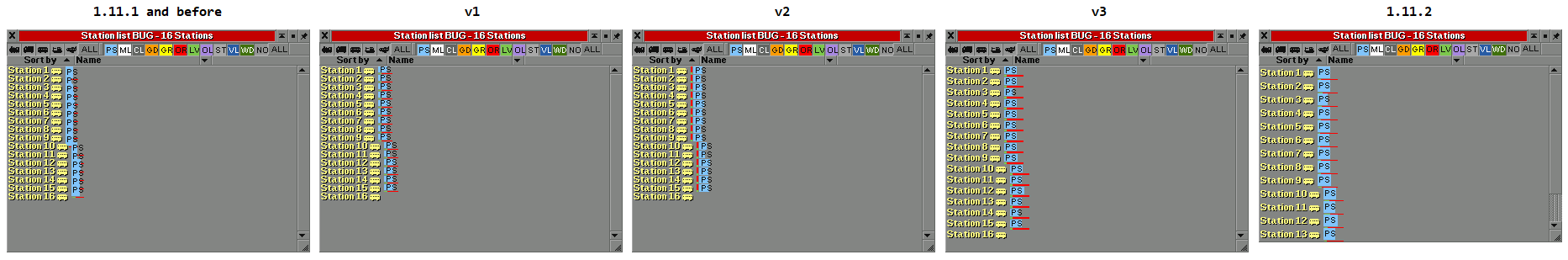
v1 - Height of the colored cargo field reduced to a minimum
v2 - Vertical, wider transport rating bar moved to the side
v3 - Color cargo field height decreased by 5 pixels, transport rating bar increased by 1
I'm not sure if it is better. I did it out of curiosity whether something more readable could be done on this scale. :) A certain advantage of v1 and v2 may be the preservation of the original spacing between lines of the text, and thus also the consistent appearance of the interface. In that case, it might be possible in the future to add a general spacing setting that would affect all GUI elements.
The text was updated successfully, but these errors were encountered: